Core DS Case Study
Core DS Case Study
A closer look at the process behind creating our Brand design system. To clearly structure the process, our primary focus will be on a small segment of the system: paid and organic ads.
Just to caveat, this page is still a work in progress 🚧
A closer look at the process behind creating our Brand design system. To clearly structure the process, our primary focus will be on a small segment of the system: paid and organic ads.
Just to caveat, this page is still a work in progress 🚧
Problems
Avoid past mistakes. Pre-rebrand, there were inconsistencies such as logo placement, margins and type sizes throughout assets
We needed to be fast. There were only 7 of us serving 150+ stakeholders across the business, each with specific needs and bespoke assets required
Multiple designers, even more Figma files. There were templates scattered about, but there was no centralised library that we could use to find what we needed right away
Goals
Act as the single source of truth and ensure complete consistency across assets
Be scalable and be able to adapt for present and future brand needs
To save time in building and searching in order to gain time for creative ideation and execution
Use Figma's functionalities to our full advantage to increase automation and optimise workflow
Phase 1: Audit
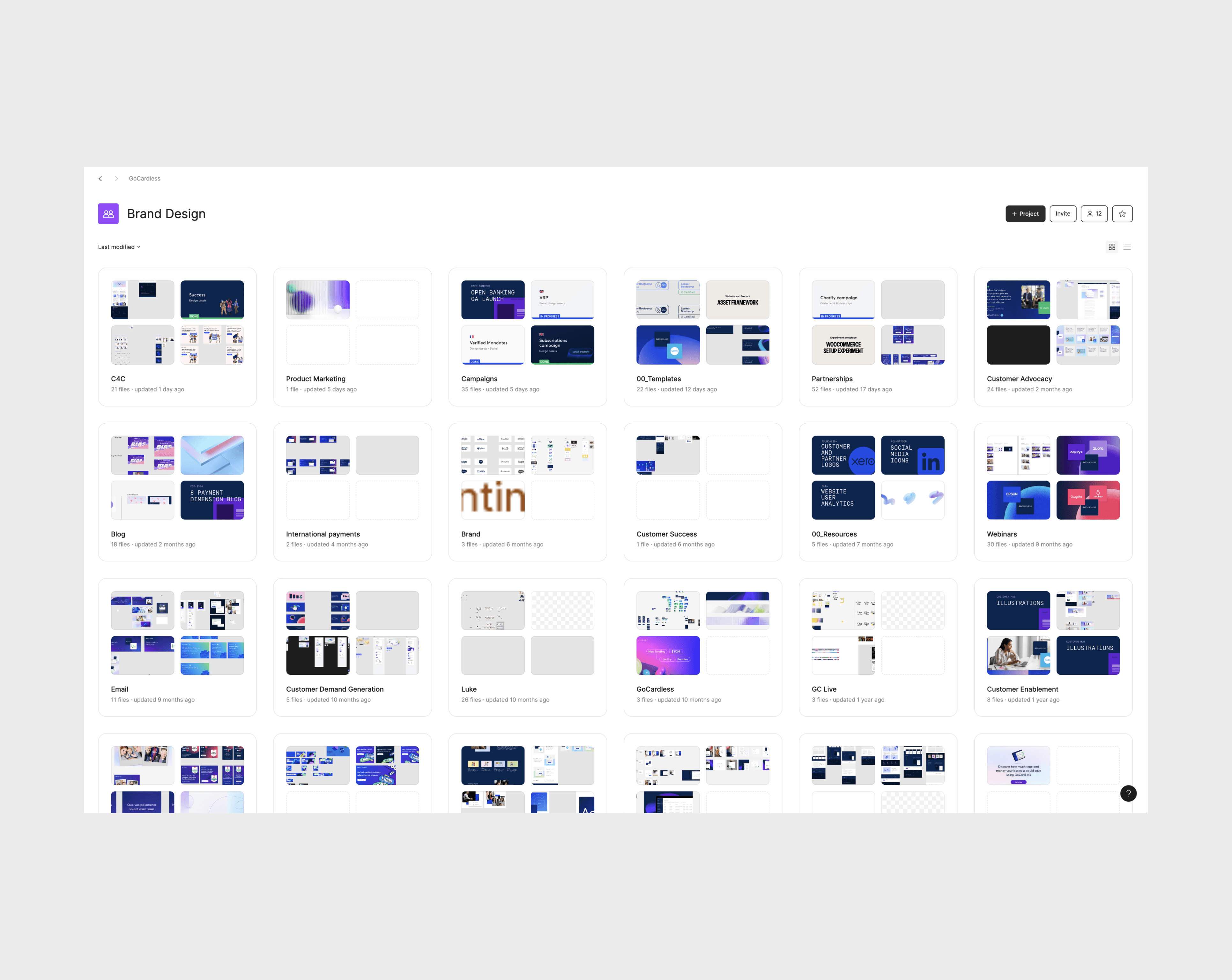
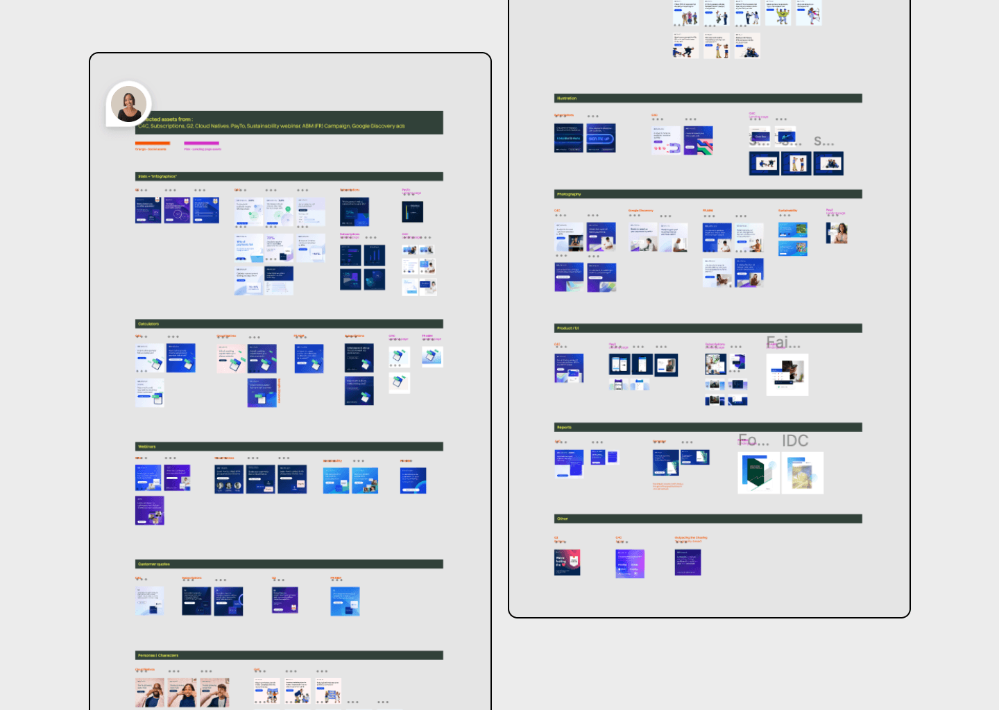
The first step was to collate assets in order to find patterns and clearly define which assets needed and most often used in order to then decide which we needed to create, simplify or deprecate.
Because I was initially deployed to work under Demand Generation for campaigns, the very start of the system focused primarily on assets that we used within campaigns specifically. Evidently in its later evolution, the system surpassed campaigns and transitioned towards being an extensive system for Brand.




Finding the inconsistencies
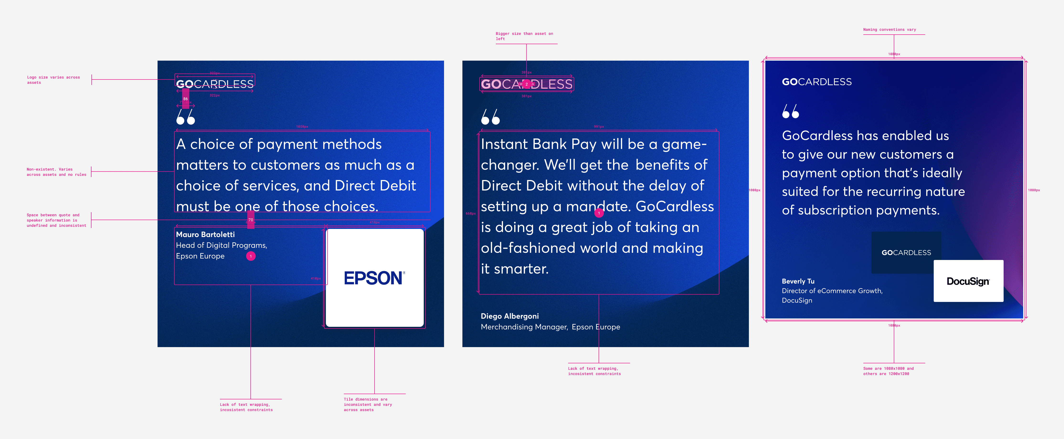
As one example (below) and a small one at that, the compilation of assets showed a significant amount of inconsistencies between three quote assets set up for different campaigns.
Finding the inconsistencies
As one example (below) and a small one at that, the compilation of assets showed a significant amount of inconsistencies between three quote assets set up for different campaigns.
Finding the inconsistencies
As one example (below) and a small one at that, the compilation of assets showed a significant amount of inconsistencies between three quote assets set up for different campaigns.
Finding the inconsistencies
As one example (below) and a small one at that, the compilation of assets showed a significant amount of inconsistencies between three quote assets set up for different campaigns.


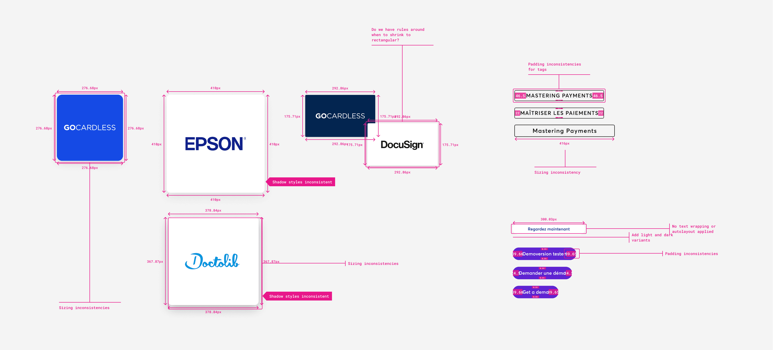
From the above example, I then isolated certain elements such as tiles, CTA buttons and pills and annotated the inconsistencies across each. This was early preparation and notes of what to avoid for when we had our visual identity for the rebrand finalised.
From the above example, I then isolated certain elements such as tiles, CTA buttons and pills and annotated the inconsistencies across each. This was early preparation and notes of what to avoid for when we had our visual identity for the rebrand finalised.
From the above example, I then isolated certain elements such as tiles, CTA buttons and pills and annotated the inconsistencies across each. This was early preparation and notes of what to avoid for when we had our visual identity for the rebrand finalised.
From the above example, I then isolated certain elements such as tiles, CTA buttons and pills and annotated the inconsistencies across each. This was early preparation and notes of what to avoid for when we had our visual identity for the rebrand finalised.


I did this audit repeatedly across our different asset categories. The rebrand was coming up and campaigns needed to be delivered within the first two weeks of the new brand going live, so we needed to be ready.
I did this audit repeatedly across our different asset categories. The rebrand was coming up and campaigns needed to be delivered within the first two weeks of the new brand going live, so we needed to be ready.
I did this audit repeatedly across our different asset categories. The rebrand was coming up and campaigns needed to be delivered within the first two weeks of the new brand going live, so we needed to be ready.
I did this audit repeatedly across our different asset categories. The rebrand was coming up and campaigns needed to be delivered within the first two weeks of the new brand going live, so we needed to be ready.


Market research
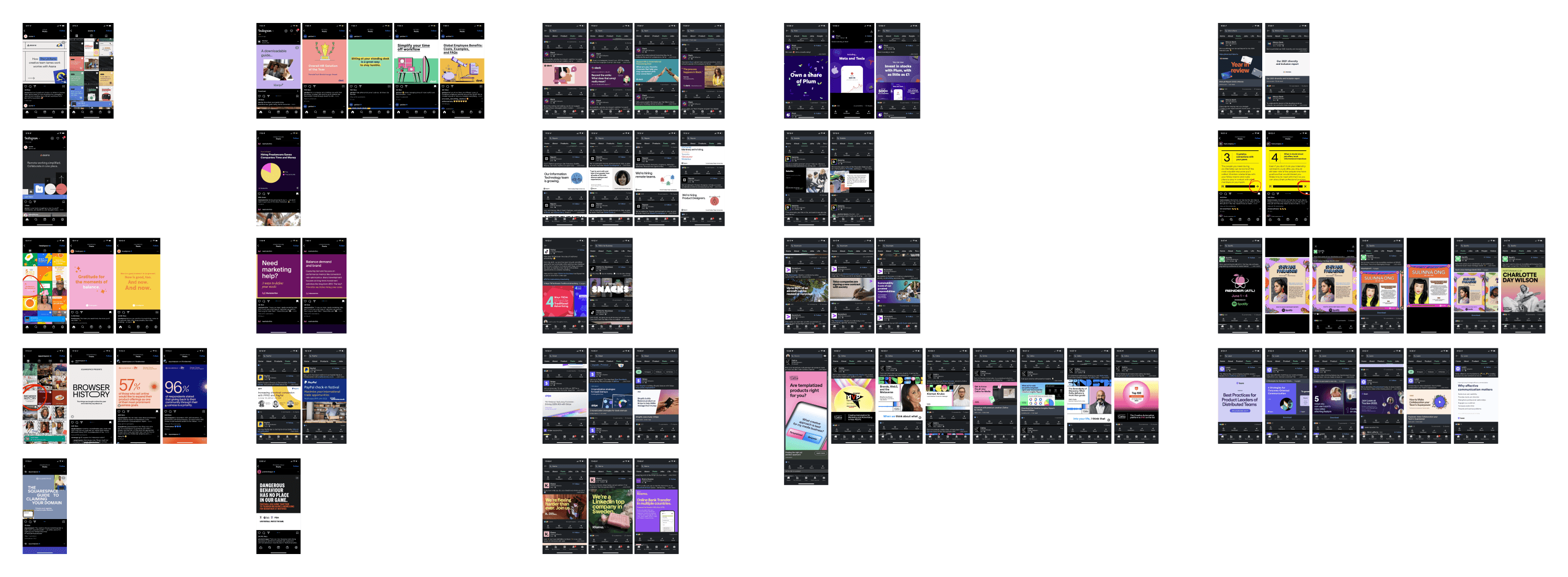
I also conducted market research and did a competitors analysis to see what others like us were doing themselves, in this example above for their paid and organic ads. The questions around this exercise followed the lines of "what could we do better?"
Market research
I also conducted market research and did a competitors analysis to see what others like us were doing themselves, in this example above for their paid and organic ads. The questions around this exercise followed the lines of "what could we do better?"
Market research
I also conducted market research and did a competitors analysis to see what others like us were doing themselves, in this example above for their paid and organic ads. The questions around this exercise followed the lines of "what could we do better?"
Market research
I also conducted market research and did a competitors analysis to see what others like us were doing themselves, in this example above for their paid and organic ads. The questions around this exercise followed the lines of "what could we do better?"
Phase 2: Setting foundations
Now we needed to start laying out the atoms. And adding auto-layout. Trying to avoid past mistakes, auto-layout at the very least should be added to our assets to add constraints and rules to avoid errors via optical adjustment. I made it my mission to apply auto-layout to (almost) everything. Brand needed to stay flexible and adapt to various platforms, mediums and needs. Not all layouts made would suit the next task, but my thinking was that at least we would always have a base to start no matter the requests.
Accessibility
Working alongside our product designers, it was ensured that accessibility was heavily taken into account in choosing our final colour palettes. Rules also translated into assets produced within Brand, everything from our print to social and paid ads needed to have accessibility taken into account.
Phase 3: Experimentation
In alignment with Product, we now had defined styles and basic rules which we could implement. Ads were the larger part of campaigns, and so experimentation was necessary to define rules for us in this area.
Phase 3: Experimentation
In alignment with Product, we now had defined styles and basic rules which we could implement. Ads were the larger part of campaigns, and so experimentation was necessary to define rules for us in this area.
Phase 3: Experimentation
In alignment with Product, we now had defined styles and basic rules which we could implement. Ads were the larger part of campaigns, and so experimentation was necessary to define rules for us in this area.
Phase 3: Experimentation
In alignment with Product, we now had defined styles and basic rules which we could implement. Ads were the larger part of campaigns, and so experimentation was necessary to define rules for us in this area.
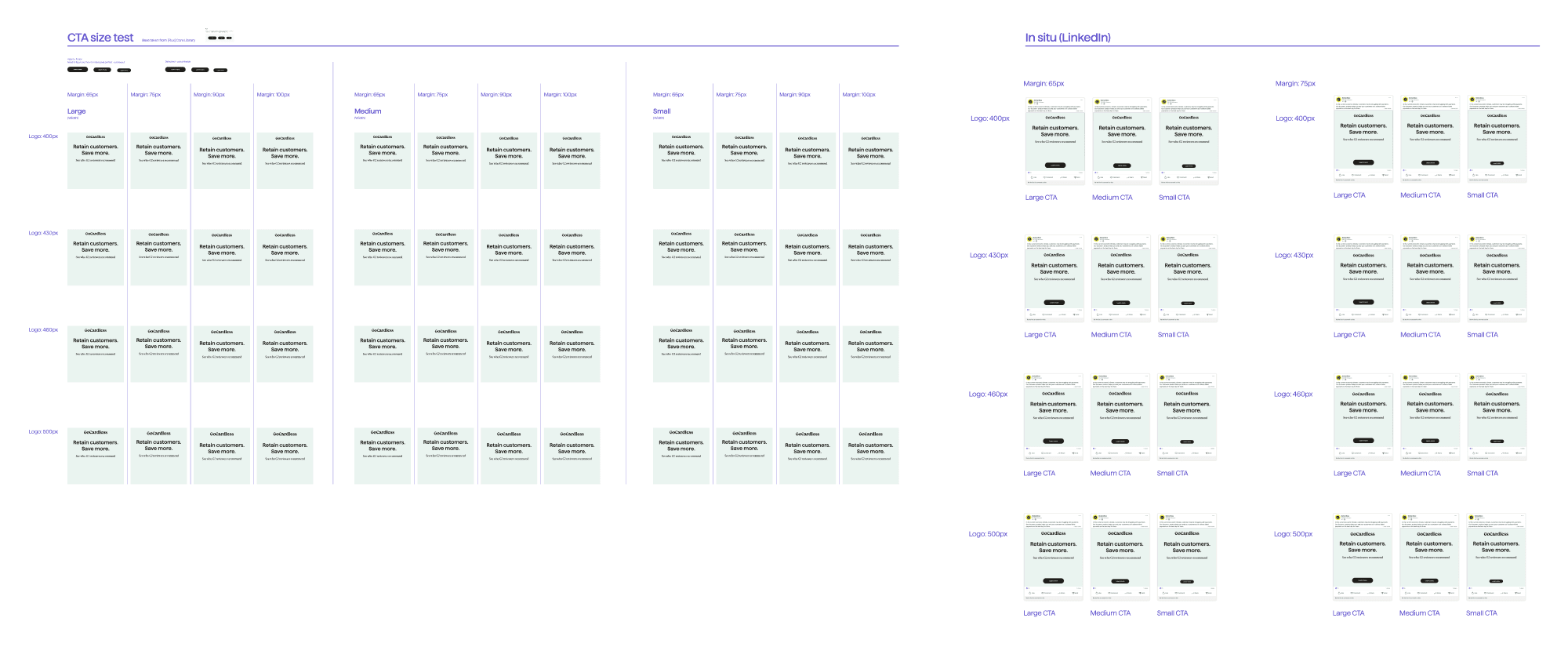


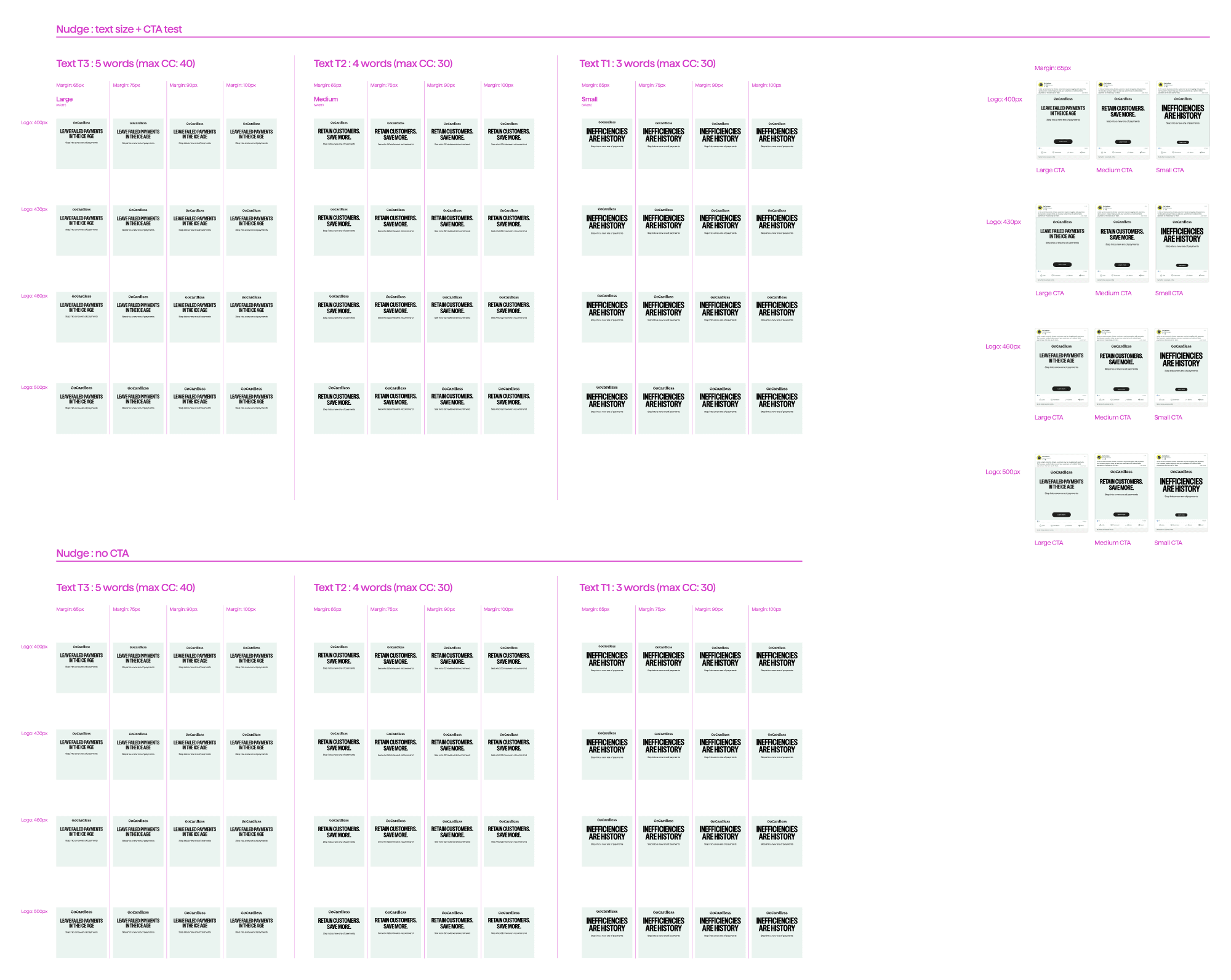
Again, focusing on ads as our primary example, I started to experiment with margins and type setting rules. Our new brand had a major shift in tone which meant that our copy needed to be bold, sharp and direct. Immediately I thought, character limits. We were missing character limits in the current brand and there were no foundational rules that we could implement.
Testing how our new typefaces could work together in our ad frames were important in order to see how much information we can fit as well as limit. I started to test character counts whilst assigning sizes to the different lengths.


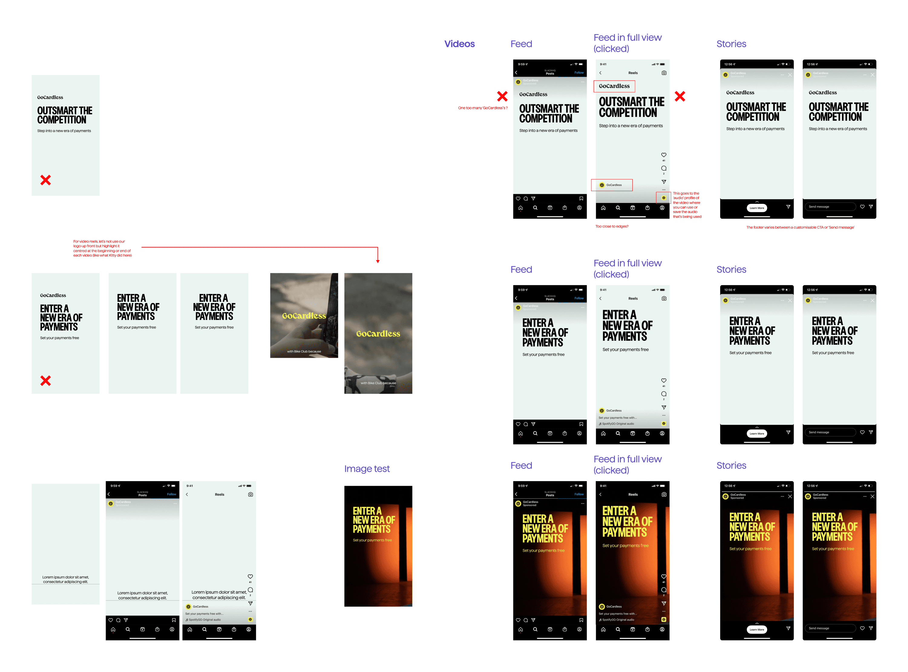
I was also testing how assets looked in-situ to see how the assets sat within and paired with different platform UIs, ensure legibility and discover issues that viewers might encounter.
I was also testing how assets looked in-situ to see how the assets sat within and paired with different platform UIs, ensure legibility and discover issues that viewers might encounter.
I was also testing how assets looked in-situ to see how the assets sat within and paired with different platform UIs, ensure legibility and discover issues that viewers might encounter.
I was also testing how assets looked in-situ to see how the assets sat within and paired with different platform UIs, ensure legibility and discover issues that viewers might encounter.


Phase 4: Decision-making
This phase is self-explanatory. The rebrand launch was coming and campaigns were demanding, we needed to make decisions based off repeated testing and evolve around that.
We tested various headlines and established character counts, taking into account that we have multiple languages we needed to accommodate.


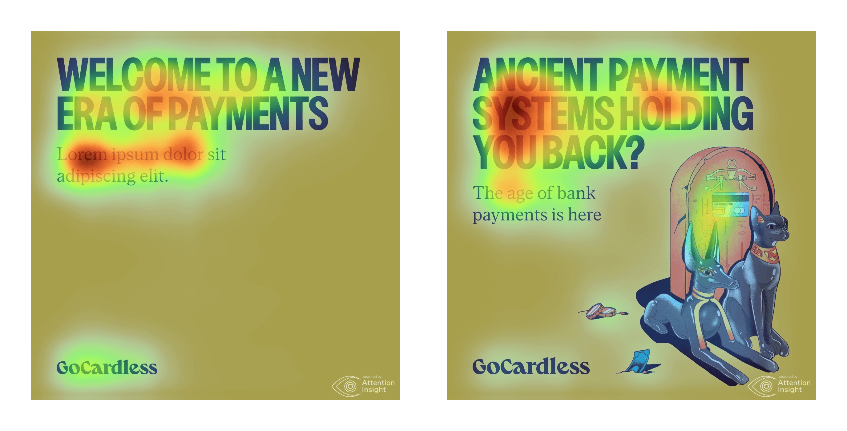
Using a Figma plugin called Attention Insight, an AI heat-mapper for very quick user testing, we were able to analyse what worked for our hierarchies and what did not. We acknowledged that AI is not perfect and to be able to conduct more accurate research we would have to conduct testing with actual people. This plugin was used to save time and quickly turnaround data to reinforce our templates and decisions made behind the information hierarchy.
Using a Figma plugin called Attention Insight, an AI heat-mapper for very quick user testing, we were able to analyse what worked for our hierarchies and what did not. We acknowledged that AI is not perfect and to be able to conduct more accurate research we would have to conduct testing with actual people. This plugin was used to save time and quickly turnaround data to reinforce our templates and decisions made behind the information hierarchy.
Using a Figma plugin called Attention Insight, an AI heat-mapper for very quick user testing, we were able to analyse what worked for our hierarchies and what did not. We acknowledged that AI is not perfect and to be able to conduct more accurate research we would have to conduct testing with actual people. This plugin was used to save time and quickly turnaround data to reinforce our templates and decisions made behind the information hierarchy.
Using a Figma plugin called Attention Insight, an AI heat-mapper for very quick user testing, we were able to analyse what worked for our hierarchies and what did not. We acknowledged that AI is not perfect and to be able to conduct more accurate research we would have to conduct testing with actual people. This plugin was used to save time and quickly turnaround data to reinforce our templates and decisions made behind the information hierarchy.


Phase 5: Components
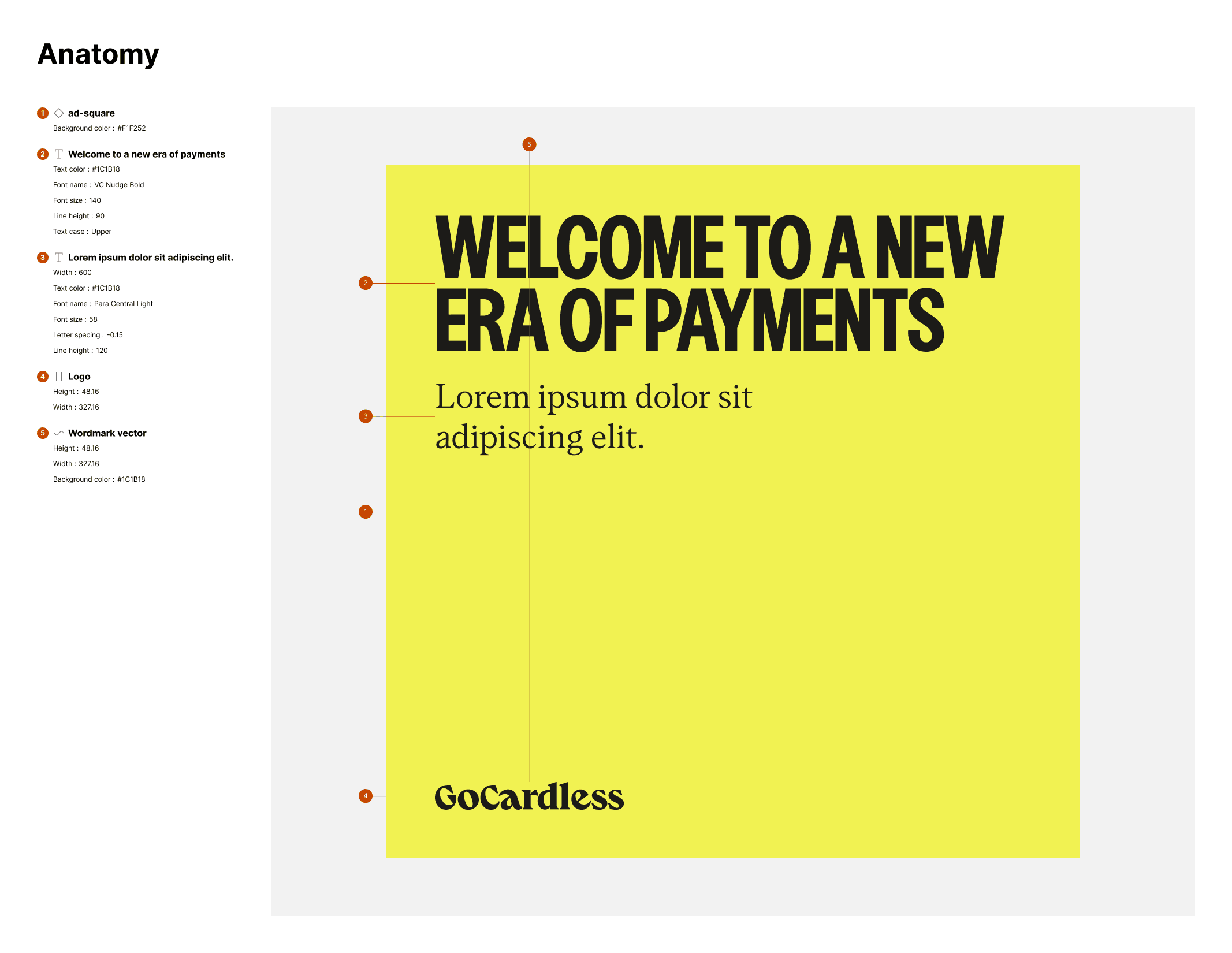
To be able to scale as quickly as the brand, working components were finally needed to be made. We had a visual system that needed to be translated across different mediums, be that emails, ads, or video.
Text sizes and naming conventions for variants
Because there were different asset sizes that we worked with ranging from small 300x250 ads to 1200x1200, size-based naming conventions seemed fitting rather than semantic. 'Regular' would come to indicate our standard default for the particular size of its parent, and the other size variants would be the defined adjustments which were dependent on the copy our stakeholders provided.
Google Drive could only help us organise so much. It was a bit messy, and not all files were Figma-compatible. We couldn't drag in inDesign documents or PDFs as an example, nor did we need to in our day to day asset production.
We became selective in what we chose to add into the library and wanted only the most commonly used assets to be immediately accessible.
Phase 6: Evolution
As with every design system, it remains a work in progress. There's a lot of tidying up to do, a lot of refinement needed and a lot of TLC to make sure it's as optimised that it can be. It's been a struggle juggling the development of this system alongside my work within Demand Generation, but I've been told that this system has revolutionised how we work within campaigns. I'm proud that it's been proven effective so far, and working on this has made me confident that design systems is what I want to pursue as a designer.
As part of my next steps, I'd like to dedicate time to create proper documentation around the assets and thoroughly map out the connections between working components.


Previous project
Next project


Previous project
Next project


Previous project
Next project


Previous project
Next project

Available for work
Available for work
Available for work
Available for work